Nudity is everywhere, but in some places it is a bigger taboo than others. This is the idea on which Mirko Ilić has based “Head to Toe,” a new book exploring nudity in graphic design.
“I noticed there were hundreds of books about nudity in art, in photography – in everything but graphic design,” he said in a phone interview. “We’ve had nudity from the very first cave paintings in Altamira, but outside of fine art, it is considered pornography.”

The fact that nudity is still a near-universal taboo is reflected in the book’s title, which doesn’t contain the word itself (“nudity” is only found in the subtitle): “We did it to not turn people away and, partly, because book sales depend on libraries, especially those in colleges and schools, where we had a risk of not being accepted. Nudity and sex are among the last taboos in the US, even though we produce and consume more porn than any other country.”
Changing culture
The history of nudity in graphic design is not a linear one, but a roller coaster of changing cultures, shifting moral landscapes and – according to Ilić – evolving creative stances.

“In the 1960s and 1970s, and before, graphic design was the business of straight white males,” he said. “Then money started to disappear and go towards advertising, which caused graphic designers to follow it there. This opened the door for new groups to go into graphic design, such as gay people, who started to influence the industry, little by little.
“Now that there’s even less money, these guys are moving into branding, and women are starting to come into graphic design. Each of these groups has brought something to the table, not only their aesthetics, but their desires too.”
The complicated history of nudes in graphic design
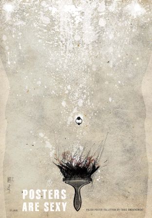
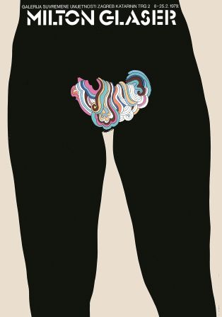
The book, which was co-created with author Steven Heller, draws on approximately 600 examples of graphic design, including magazines, book covers, posters and ads. Taken mostly from the last two decades, they highlight how graphic design has handled nudity differently from figure-drawing and painting.
“I wanted to show the amazingly beautiful things that come from so many different sources using nudity. In art school they put a naked lady in front of you in the first year. But in design schools it never happens. It’s like you decided to paint, and never use one color because it’s not appropriate,” said Ilić.
The eye of the beholder
Bosnian-born Ilić had a career as a comics artist before moving into graphic design and relocating to New York. He has since worked for the New York Times, the Wall Street Journal and Time magazine as an illustrator or art director, and 39 of his works are in the permanent collection at New York’s Museum of Modern Art.
“When I was an illustrator at the New York Times, the book reviews section used a lot of long, horizontal illustrations,” Ilić said. “Suddenly editors started telling me, ‘This looks like a penis!’ just because it was long and horizontal. It was fascinating: you had highly educated people in three-piece suits, looking at the drawing of an umbrella trying to decide if it looked too much like a penis.”
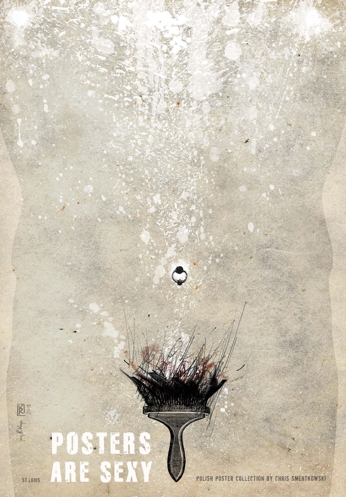
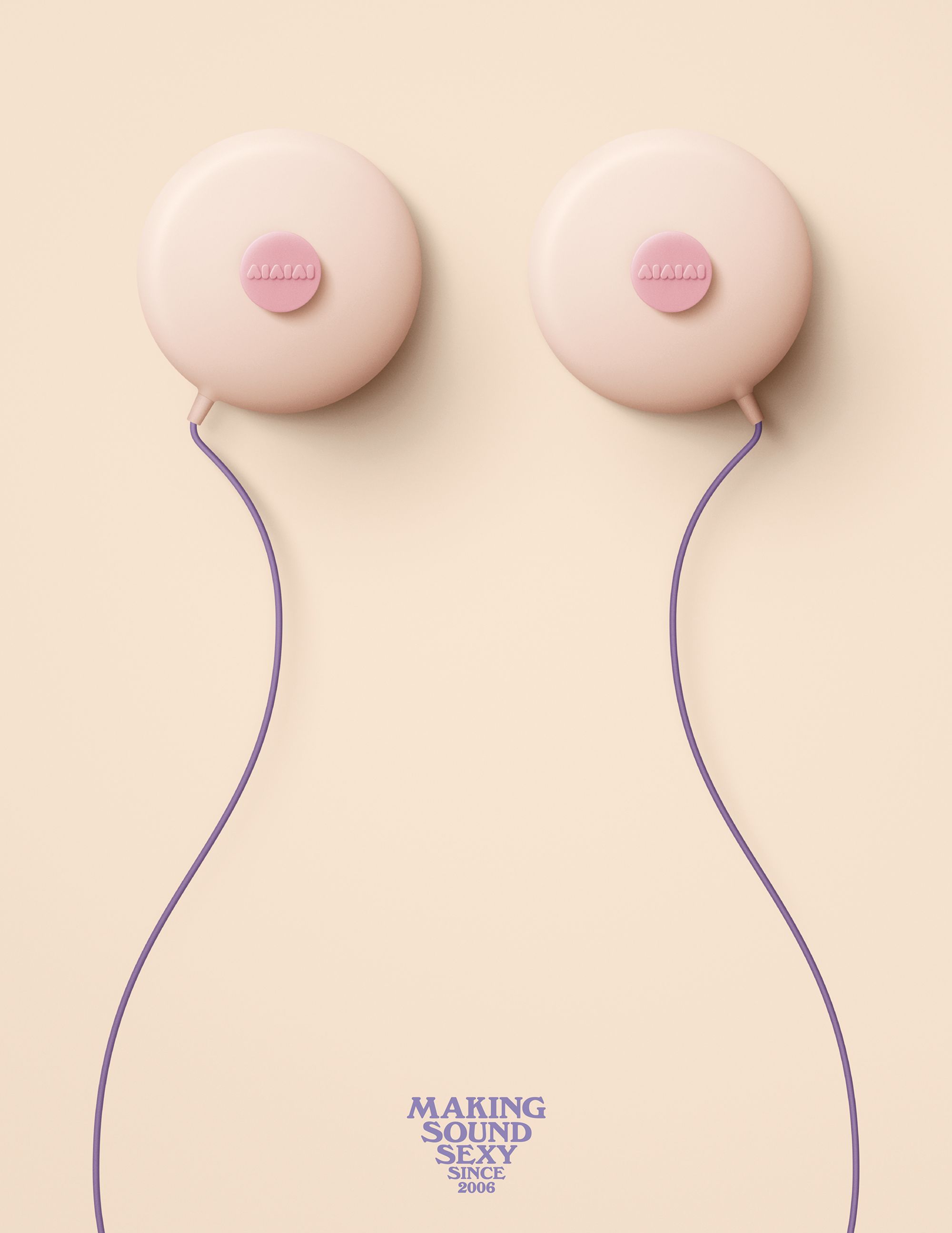
The uncanny ability of the human mind to see genitals everywhere has been long exploited in graphic design. The book offers several examples of suggestive ads, such as one for Aiaiai headphones (above) in which the earbuds look like a pair of breasts, the cords resemble the outline of a female body and the text is arranged to resemble pubic hair.
Art of suggestion
“People like to feel clever,” Ilić said. “One of the most successful logos in the world is ‘I Love New York’ by Milton Glaser, not only because how simple it is, but also because it’s a little puzzle. Now, of course, everybody knows it, but back when it was launched people felt a little bit brighter if they figured it out. That’s the same thing that happens with suggestive images showing objects that look sexual but have nothing to do with sex.”
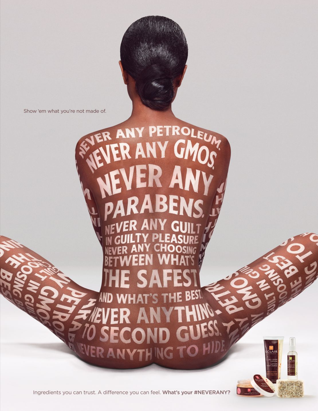
Nudity can also be used as a shock factor for social causes: PETA routinely uses it to send messages about fur, while breast cancer campaigns regularly use naked bodies, showing either breasts or the absence of them as a result of mastectomy.
An interesting case, notes Ilić, is book covers, where female nudity often appears in the form of a naked back: “That’s because it’s suggestive, you can show a lot of skin but nothing sexual, and it’s easy to write titles on.”

For Ilić’s book, though, he decided to hide an Easter egg in an unlikely spot: “What I really like on this book is the spine, because it shows a naked body from behind, which is also a spine – and the logo of the publisher is in the crack! That was my little subversion.”

