Story highlights
Artists have developed tricks to fool the brain
Visual system has fast stream that helps us navigate and slow, detail-oriented stream
Luminance and color are important in creating illusions in artworks
Pablo Picasso once said, “We all know that Art is not truth. Art is a lie that makes us realize truth, at least the truth that is given us to understand. The artist must know the manner whereby to convince others of the truthfulness of his lies.”
If we didn’t buy in to the “lie” of art, there would obviously be no galleries or exhibitions, no art history textbooks or curators; there would not have been cave paintings or Egyptian statues or Picasso himself. Yet, we seem to agree as a species that it’s possible to recognize familiar things in art and that art can be pleasing.
To explain why, look no further than the brain.
The human brain is wired in such a way that we can make sense of lines, colors and patterns on a flat canvas. Artists throughout human history have figured out ways to create illusions such as depth and brightness that aren’t actually there but make works of art seem somehow more real.
And while individual tastes are varied and have cultural influences, the brain also seems to respond especially strongly to certain artistic conventions that mimic what we see in nature.
What we recognize in art
It goes without saying that most paintings and drawings are, from an objective standpoint, two-dimensional. Yet our minds know immediately if there’s a clear representation of familiar aspects of everyday life, such as people, animals, plants, food or places. And several elements of art that we take for granted trick our brains into interpreting meaning from the arbitrary.
Lines
For instance, when you look around the room in which you’re sitting, there are no black lines outlining all of the objects in your view; yet, if someone were to present you with a line-drawing of your surroundings, you would probably be able to identify it.
This concept of line drawings probably dates back to a human ancestor tracing lines in the sand and realizing that they resembled an animal, said Patrick Cavanagh, professor at Universite Paris Descartes.
“For science, we’re just fascinated by this process: Why things that are not real, like lines, would have that effect,” Cavanagh said. “Artists do the discoveries, and we figure out why those tricks work.”
That a line drawing of a face can be recognized as a face is not specific to any culture. Infants and monkeys can do it. Stone Age peoples did line drawings; the Egyptians outlined their figures, too.
It turns out that these outlines tap into the same neural processes as the edges of objects that we observe in the real world. The individual cells in the visual system that pick out light-dark edges also happen to respond to lines, Cavanagh said. We’ll never know who was the first person to create the first “sketch,” but he or she opened the avenue to our entire visual culture.
Faces
This brings us to modern-day emoticons; everyone can agree that this :-) is a sideways happy face, even though it doesn’t look like any particular person and has only the bare minimum of facial features. Our brains have a special affinity for faces and for finding representations of them (some say they see the man in the moon, for instance). Even infants have been shown in several studies to prefer face-like patterns over patterns that don’t resemble anything.
That makes sense from an evolutionary perspective: It benefits babies to establish a bond with their caregivers early on, notes Mark H. Johnson in a 2001 Nature Reviews Neuroscience article.
Our primitive human ancestors needed to be attuned to animals around them; those who were most aware of potential predators would have been more likely to survive and pass on their genes.
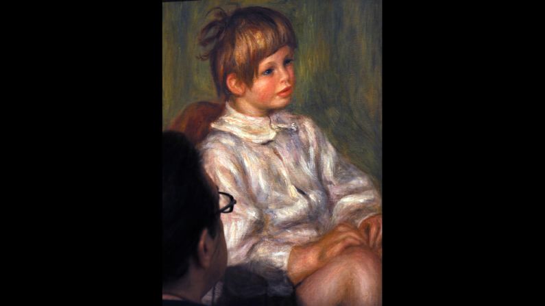
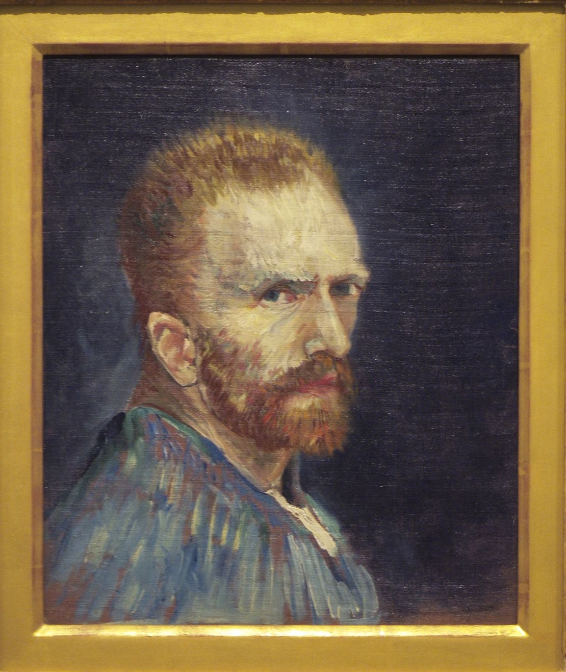
So our brains readily find faces in art, including in Impressionist paintings where faces are constructed from colored lines or discrete patches of color. This “coarse information” can trigger emotional responses, even without you bearing aware of it, Cavanagh and David Melcher write in the essay “Pictorial Cues in Art and in Visual Perception.”
Patrik Vuilleumier at the University of Geneva and colleagues figured out that the amygdala, a part of the brain involved in emotions and the “flight or fight response,” responds more to blurry photos of faces depicting fear than unaltered or sharply detailed images. At the same time, the part of our brain that recognizes faces is less engaged when the face is blurry.
Cavanagh explains that this may mean we are more emotionally engaged when the detail-oriented part of our visual system is distracted, such as in Impressionist works where faces are unrealistically colorful or patchy.
Color vs. luminance
Artists also play with the difference between color and luminance.
Most people have three kinds of cones in the eye’s retina: red, blue and green. You know what color you’re looking at because your brain compares the activities in two or three cones. A different phenomenon, called luminance, adds the activities from the cones together as a measure of how much light appears to be passing through a given area.
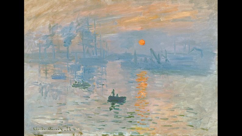
Usually when there is color contrast, there is also luminance contrast, but not always. In the research of Margaret Livingstone, professor of neurobiology at Harvard University, she explored the painting “Impression Sunrise” by Claude Monet, which features a shimmering sun over water. Although the orange sun appears bright, it objectively has the same luminance as the background, Livingstone found.
So why does it look so bright to the human eye?
Livingstone explained in a 2009 lecture at the University of Michigan that there are two major processing streams for our visual system, which Livingstone calls the “what” and “where” streams. The “what” allows us to see in color and recognize faces and objects. The “where” is a faster and less detail-oriented but helps us navigate our environment but is insensitive to color.
When our brains recognize a color contrast but no light contrast, that’s called “equal luminance,” and it creates a sort of shimmering quality, Livingstone said. And that’s what’s going on in a Monet painting.
Artists often play with luminance in order to give the illusion of three dimensions, since the range of luminance in real life is far greater than what can be portrayed in a painting, Livingstone said. By placing shadows and lights that wouldn’t be present in real life, paintings are able to trick the eye into perceiving depth.

For instance, medieval paintings portrayed the Virgin Mary in a dark blue dress, which makes her look flat. Leonardo da Vinci, however, revolutionized her appearance by adding extra lights to contrast with darks.
The bottom line: To trick the brain into thinking something looks three-dimensional and lifelike, artists add elements – lightness and shadows – that wouldn’t be present in real life but that tap into our hard-wired visual sensibilities.
Mona Lisa’s smile
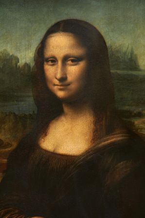
The Mona Lisa is undoubtedly one of the world’s most famous paintings; the face of the woman in the painting is iconic.
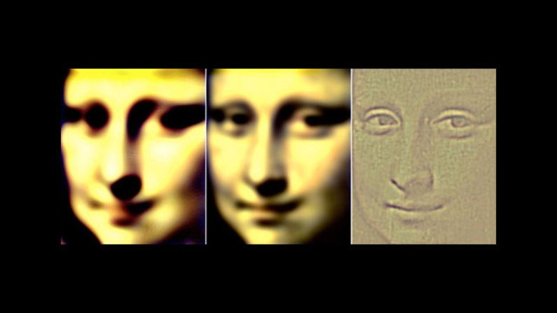
Da Vinci gave her facial expression a dynamic quality by playing with a discrepancy that exists in our peripheral and central vision systems, Livingstone says.
The human visual system is organized such that the center of gaze is specialized for small, detailed things, and the peripheral vision has a lower resolution – it’s better at big, blurry things.
That’s why, as your eyes move around the Mona Lisa’s face, her expression appears to change, Livingstone says. The woman was painted such that, looking directly at the mouth, she appears to smile less than when you’re staring into her eyes. When you look away from the mouth, your peripheral visual system picks up shadows from her cheeks that appear to extend the smile.
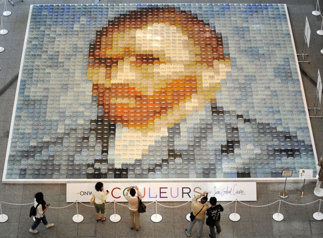
Photomosaics also take advantage of this difference between visual systems: With your peripheral visual system you might see a picture of a cat that’s composed of individual photos of cats that are completely different.
Shadows and mirrors
From a scientific standpoint, it’s possible to determine exactly how shadows are supposed to look based on the placements of light and how mirror reflections appear at given angles. But the brain doesn’t perform such calculations naturally.
It turns out that we don’t really notice when shadows in paintings are unrealistically placed, unless glaringly so, or when mirrors don’t work exactly the way they do in real life, Cavanagh explained in a 2005 article in “Nature.”
Shadows are colored more darkly than what’s around them; it’s not readily apparent if the lighting direction is inconsistent. They can even be the wrong shape; as long as they don’t look opaque, they help convince us of a three-dimensional figure.
Studies have shown that people don’t generally have a good working knowledge of how reflections should appear, or where, in relation to the original object, Cavanagh said. Paintings with people looking into mirrors or birds reflected in ponds have been fooling us for centuries.
Why we like art
There are certain aspects of art that seem universally appealing, regardless of the environment or culture in which you grew up, argues V.S. Ramachandran, a neuroscientist at the University of California, San Diego. He discusses these ideas in his recent book “The Tell Tale Brain.”
Symmetry, for instance, is widely considered to be beautiful. There’s an evolutionary reason for that, he says: In the natural world, anything symmetrical is usually alive. Animals, for instance, have symmetrical shapes.
That we find symmetry artistically appealing is probably based on a hard-wired system meant to alert us to the possibility of a living thing, he said.
And then there’s what Ramachandran calls the “peak shift principle.” The basic idea is that animals attracted to a particular shape will be even more attracted to an exaggerated version of that form.
This was shown in an experiment by Niko Tinbergen involving Herring seagull chicks. In a natural environment, the chick recognizes its mother by her beak. Mommy seagull beaks are yellow with a red spot at the end. So if you wave an isolated beak in front of a chick, it believes the disembodied beak is the mother and taps it as a way of asking to be fed.
But even more striking, if you have a long yellow stick with a red stripe on it, the chick still begs for food. The red spot is the trigger that tells the chick this is the mother who will feed it. Now here’s the crazy part: the chick is even more excited if the stick has multiple red stripes.
The point of the seagull experiment is that although the actual mother’s beak is attractive to the chick, a “super beak” that exaggerates the original beak hyperactivates a neural system.
“I think you’re seeing the same thing with all kinds of abstract art,” Ramachandran said. “It looks distorted to the eye, but pleasing to the emotional center to the brain.”
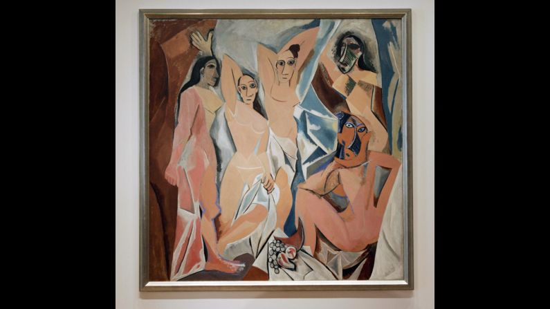
In other words, the distorted faces of famous artists such as Pablo Picasso and Gustav Klimt may be hyperactivating our neurons and drawing us in, so to speak. Impressionism, with its soft brushstrokes, is another form of distortion of familiar human and natural forms.
Further research: Can we know what is art?
There’s now a whole field called neuroesthetics devoted to the neural basis of why and how people appreciate art and music and what is beauty.
Semir Zeki at University College London is credited with establishing this discipline, and says it’s mushrooming. Many scientists who study emotion are collaborating in this area. Zeki is studying why people tend prefer certain patterns of moving dots to others.
Stanford Journal of Neuroscience: The Neuroscience of Art
There have been several criticisms about neuroesthetics as a field. Philosopher Alva Noe wrote in The New York Times last year that this branch of science has not produced any interesting or surprising insights, and that perhaps it won’t because of the very nature of art itself – how can anyone ever say definitively what it is?
Zeki said many challenges against his field are based on the false assumption that he and colleagues are trying to explain works of art.
“We’re not trying to explain any work of art,” he said. “We’re trying to use works of art to understand the brain.”
Neuroscientists can make art, too.
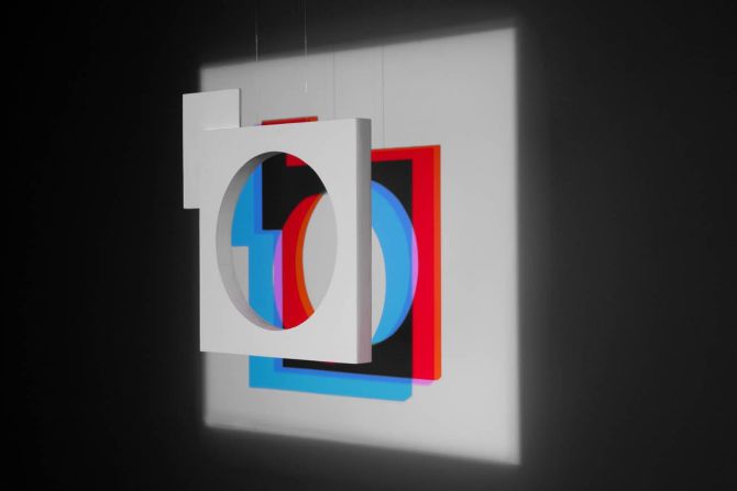
Zeki had works in an exhibit that opened last year in Italy called “White on White: Beyond Malevich.” The series included white painted sculptures on white walls, illuminated by white light and color projections. With red and white light, the shadow of the object appears in the complementary color – cyan – and the shadows change as your angle of vision changes.
The biological basis for this complementary color effect is not well understood, nor is the depth of shadow, which is also an illusion.
So was Picasso right – is art a lie? The description of Zeki’s exhibition in Italy may highlight the truth:
“Our purpose is to show how the brain reality even overrides the objective reality.”


