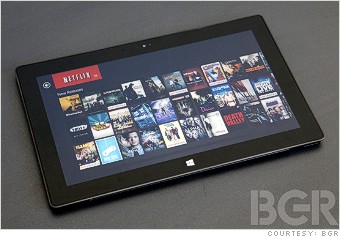

Microsoft's new Surface tablet kicks off its Windows 8 push -- the biggest risk Microsoft has taken in decades. BGR executive editor Zach Epstein put it to the test.

The most important part of any tablet is the display.
Microsoft came out swinging, claiming that its display is sharper than the Retina panel on Apple's third-generation iPad. That confounded tech enthusiasts. How could Microsoft possibly claim that its 1,366 x 768-pixel Surface display is superior in any way to the 2,048 x 1,536-pixel panel on Apple's iPad?
The answer: This isn't a straight numbers game. Lots of elements play into display quality, including the subpixel layout and the reflective qualities of the glass.
Where brightness, color saturation and contrast are concerned, the edge goes to the iPad. Looking at the same image on both devices, I find that blacks are deeper, whites are brighter and colors are much more vibrant on Apple's Retina panel.
Things change when lighting is less than optimal. The Surface cuts down on reflections, which offers a huge improvement in many common lightning situations like outside viewing.
On clarity and sharpness, it's a tough call. For reading text, I prefer the Surface. ClearType is great for displaying smooth characters, but Microsoft's display is also much warmer than Apple's. Using the Surface for hours on end didn't strain my eyes.
You'll see reviews and tests dissecting each display panel in excruciating detail. I can't say which will win out in each of the lab scenarios, but I can say this: Unless you have microscopes in place of eyeballs, it doesn't really matter.


