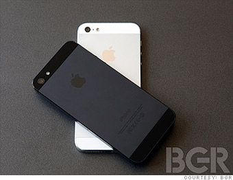

The insta-reviews of Apple's iPhone 5 were glowing -- and then the complaints started. BGR's Zach Epstein tested the iPhone 5 for a full month to see how it fares against rivals.

The one misstep I've found is a pretty surprising one: the color of the removable SIM card tray on the black iPhone does not match the color of the antenna in which it is seated. While this seems superficial, it's shocking considering how much time and effort was put into every last detail on this smartphone. On the white iPhone 5, the SIM tray matches the antenna perfectly.
The look of the white iPhone screams "Apple." It's gorgeous. Period. The black model, though, is a stark departure from other modern Apple products. It's so very, very dark. The black iPhone 4 and 4S have silver aluminum accents to break up the darkness, but every visible part of the iPhone 5's case is a shade of black.
My wife hit the nail on the head when she likened the black iPhone 5 to KITT, Michael Knight's car in the 1980s TV series Knight Rider. The device itself is sleek and modern, but the color scheme screams '80s. After a month with the phone, I'm still torn. Some days I think it looks slick and understated. Other days it strikes me as a prop from a 30-year-old sci-fi movie.


