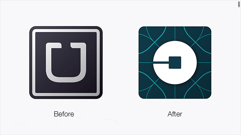
Uber has a new logo and lots of people hate it.
Instead of the stylized white and black "U," the new design features an image that the company calls the "atom and bit."
While a few offered praise for the update, the news has some folks on Twitter (TWTR) confused or downright angry.
"This new logo/branding looks disgusting @Uber, your old one was classier," one user wrote.
"Um, two words for the new #uber logos 1) underwhelming 2) why? Change for change's sake not wise or good- EVER @Uber," another tweet reads.
Uber co-founder and CEO Travis Kalanick personally worked on the rebranding, and tried to explain redesign in a blog post.
"[Uber is] a transportation network, woven into the fabric of cities and how they move. To bring out this human side...we've added color and patterns," Kalanick wrote.
Related: 10 logo changes that drove people crazy
The new logo will be used worldwide, according to a spokeswoman, but it will have a unique color scheme in each of the 68 countries that the company operates in.
Kalanick added that Uber spent months researching local cultures, scenery and architecture to develop different pallets to decorate its app.
Uber has also refreshed the typeface for its main logo.
"Some might say it's less fussy," Kalanick's post reads.
But if the most valuable startup in the world -- Uber has been valued at $65 billion -- was hoping to shed its critics along with its old logo, the company is out of luck.
Related: Uber drivers: Welcome to America's job market -- finally
A onslaught of social media users said that the new look won't make Uber-users out of people who oppose its business practices.
"Less money to drivers. Now they can make a new logo. Wow, thanks Uber," one user wrote in an Instagram comment.
"All the professional graphic art work in the world won't save your company from what's due to you for [screwing over] the drivers," a Twitter post reads.
The rebranding came one day after drivers protested the company in New York City after it cut its rates.


