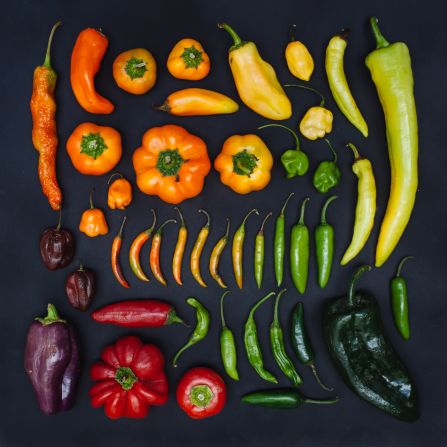
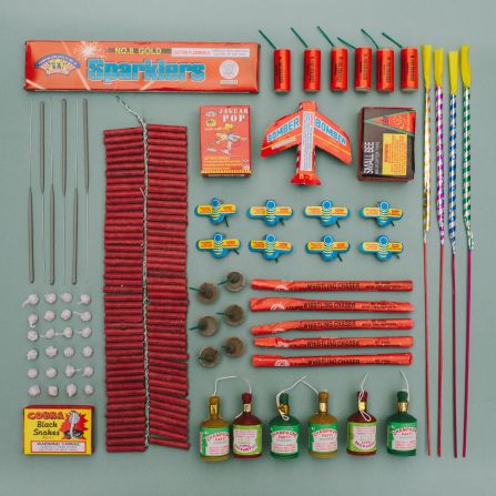
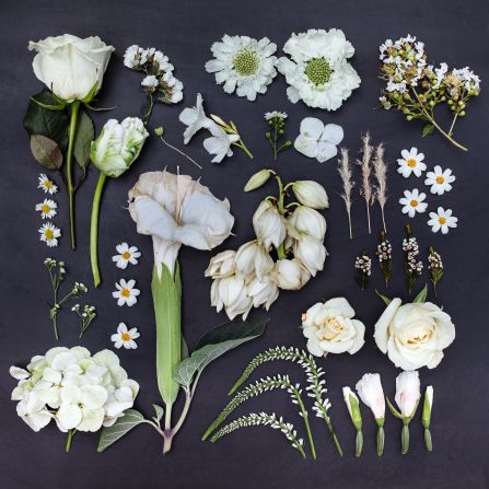
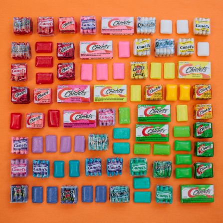
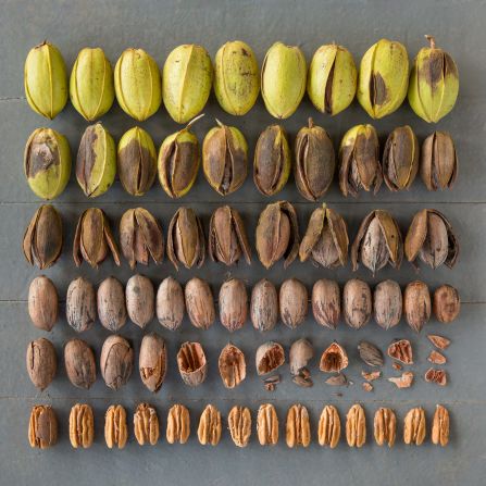
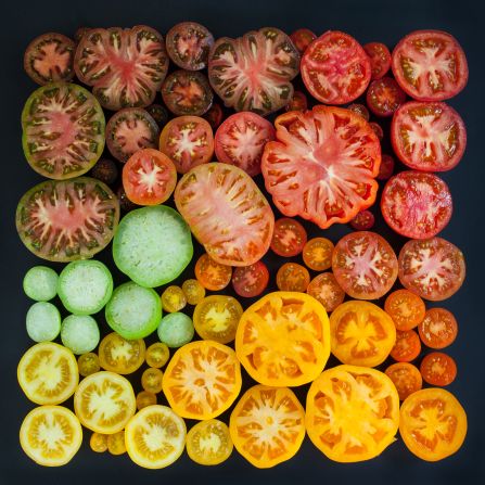
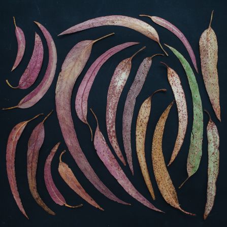
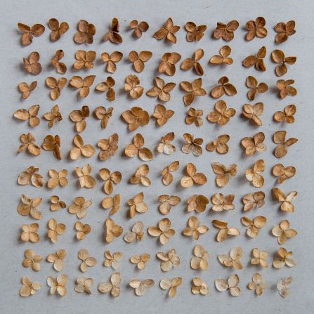
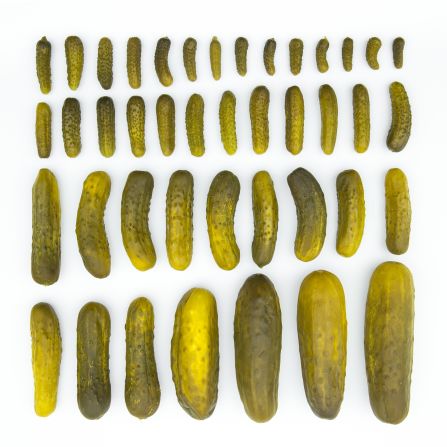
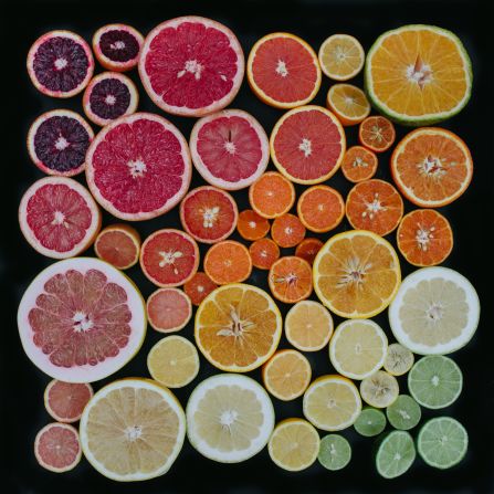
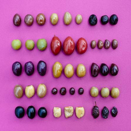
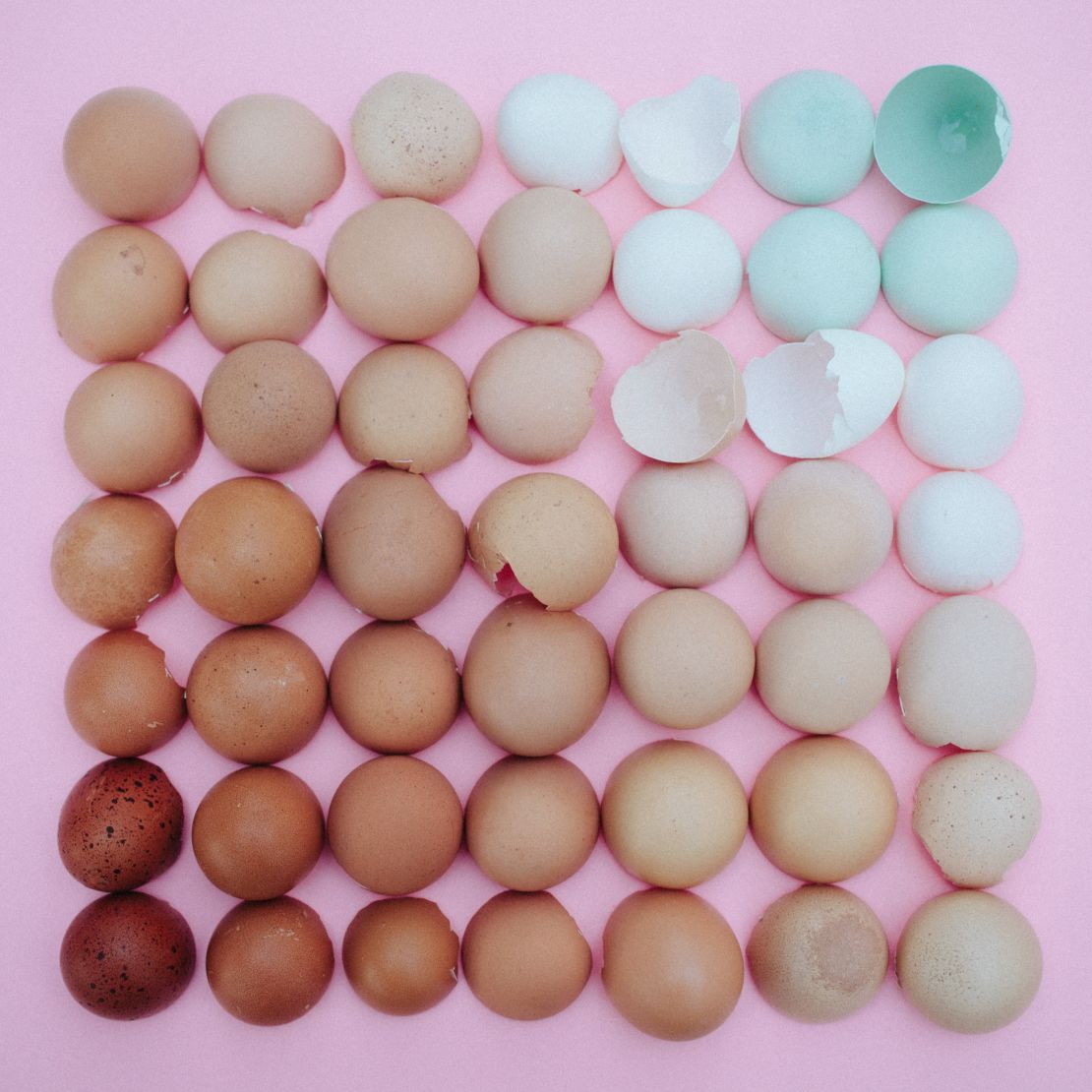
Emily Blincoe’s Instagram feed is a virtual haven for neat freaks everywhere. Scroll through, and you’ll find image after satisfying image of food, plants and household goods arranged in a tidy, grid-like manner that suggests either an artist’s eye or a latent psychological disorder.
The Nashville-based photographer is a master of what has come to be known as “organization porn,” stylized images of everyday objects stacked, laid and arranged in a neat, visually pleasing way.
These images have risen to viral prominence on sharing platforms like Reddit, Pinterest and Tumblr, as well as social media networks like Instagram.
Since Blincoe started her hyper-organized “Arrangements” series in 2011, she has built her name off this aesthetic. Though it started as a personal project, she’s since created similar images for Gap, Target, and eBay.
Color-coded arrangements for your inner neat freak
“You could take a photo of a bouquet of flowers or you could spend five hours clipping the tops and arranging them by gradient,” she says. “It’s just a different way of looking at something that other people aren’t willing to put in the time for.”
But why are these images so popular among the neat and messy alike? Psychologists may have the answer.
Balancing order and chaos
According to Johan Wagemans, an experimental psychologist specializing in visual perception at Belgium’s University of Leuven, these images are fundamentally different from the stimuli the brain ordinarily gets.
Though the individual components depicted are familiar, the new context requires that the viewer look for more than just literal meaning in the image, much like abstract art.
“It’s the fascination of the image being something different than a messenger of meaning,” he explains. “Whenever we see things in our environment or when we look at images, the brain is organizing the inputs or trying to make sense of them. Usually, perception is after meaning, but when you start playing with images in a way like this, it’s clear that it’s not about meaning, it’s about the special relationship between things and how they form a group or a composition.”
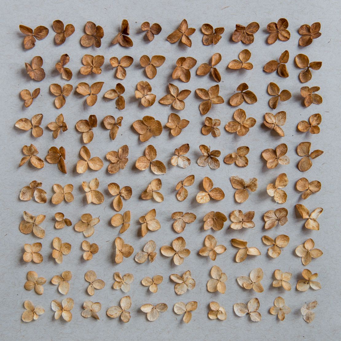
A typical, naturally occurring composition – say, leaves on a tree – does not merit a second look because it is both conventional and chaotic. A heap of leaves is uninteresting for the same reason.
“Suddenly there’s a structure or a composition on a higher level by arranging objects in a specific way,” he says. “The combination between things that are very familiar and boring in themselves but are suddenly subject to a new organization creates something that wasn’t there in the beginning.”
Indeed, this is what initially attracted Cincinnati-based designer Austin Radcliffe to this style of image. As curator of Things Organized Neatly, a popular blog and go-to source for these hyper-organized images, he’s seen thousands.
“What I like about it is visual interest, and the ways in which the objects relate to each other when you put them together. They can tell a story or draw comparisons or, at the very least, make things look nice together,” he says.
Radcliffe first started curating images in 2010, inspired by the gridded layouts designers used to organize their work, and the concept of “knolling” popularized by artist Tom Sachs. (Radcliffe would go on to intern for Sachs in 2012.)
Since then, he’s amassed more than 350,000 blog followers, spoken at the Tate Modern and Tate Britain art museums in London, and published a book in 2016.
Calmness and clarity
But for many of Radcliffe’s followers, the appreciation goes beyond the aesthetic.
“I hear that a lot people go to my website to calm down, or to take a break, or relax or procrastinate,” he says.
“I think there’s a calmness and sort of clarity to see everything that’s been neatly laid out, and clutter’s been erased. It’s just a very peaceful, serene way of organizing objects.”
Kathleen Vohs, a marketing professor at the Carlson School of Management at the University of Minnesota, isn’t surprised by this reaction.
“Clutter is very stressful on people’s psychology, and there have been a number of studies that have looked at what clutter does to people’s minds, and from that we can take the perspective that things that are tightly organized are going to have the opposite effect,” says Vohs.
Her own research, published in the peer-reviewed journal Psychological Science, supports that claim. After having participants work in either a tidy or cluttered environment, researchers observed that tidy environments encouraged participants to “follow norms and stick to the rules.”
“People find rule-following to be comforting because they know exactly what to do, and not a lot of decisions have to be made,” she says.
“If people are perhaps stressed out or somewhat exhausted from their normal everyday lives, looking at a hyper-tidy environment, a hyper-organized environment could give that sense of calm or release because it sort of suggests that all you have to do is follow the rules, and everything will be okay.”
Photographer Blincoe agrees, suggesting that the images are as calming to create as they are to consume.
“I’m not so particular in my personal life, you know. My house isn’t arranged by color, everything isn’t in place at all times. But I think it’s a good little kind of retreat for me to present these items in a visually appealing way,” she says.
“It’s not something that I set up like, ‘Oh, thank god I got that out of me,’ but you know, it’s definitely a part of what I love to do.”


