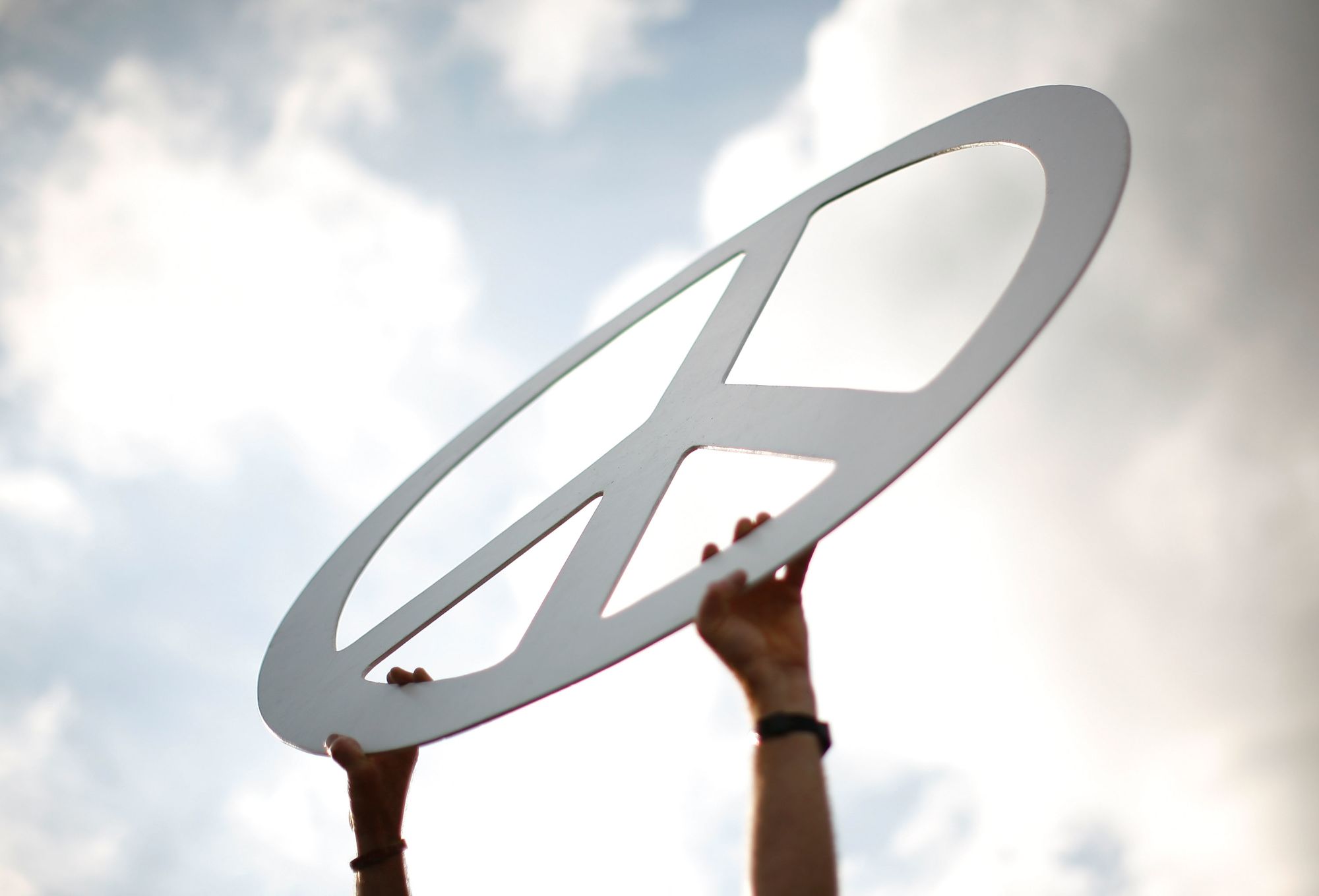
Editor’s Note: Read more unknown and curious design origin stories here.
On Good Friday 1958, thousands gathered in London’s Trafalgar Square to protest nuclear weapons. They were responding to a string of test blasts conducted by the United Kingdom, the third nation to join the nuclear club after the US and USSR.
For the next four days, the bravest among them marched to Aldermaston, a small village 50 miles west of London where British nuclear weapons were designed and stockpiled.
On the protesters’ signs and banners, a new symbol was making its first appearance. Gerald Holtom, a designer and a pacifist, had developed it specifically for the march just a few weeks prior. He believed that a symbol would make the message stronger.
He was right: The symbol was adopted soon after by the Campaign for Nuclear Disarmament (CND) and went on to become one of the most widely recognized designs in history.
“It’s a minor masterpiece with major evocative power,” said design guru and cultural critic, Stephen Bayley, in an email. “It speaks very clearly of an era and a sensibility.
“It is, simply, a fine period piece: the ordinary thing done extraordinarily well.”
Semaphore alphabet
The design is meant to represent the letters “N” and “D” – standing for “nuclear disarmament” – as they appear in the semaphore alphabet, which is used by sailors to communicate from a distance with flags.
But there’s another meaning, according to its creator. In a letter to Hugh Brock, editor of the British magazine Peace News, Holtom wrote: “I drew myself: the representative of an individual in despair, with hands palm outstretched outwards and downwards in the manner of Goya’s peasant before the firing squad. I formalized the drawing into a line and put a circle round it.”
The symbol has been the subject of various different interpretations since its inception. “All good graphic devices should be lucid and capable of applications in different media,” said Bayley. “But this one has the advantage of a nice semantic ambiguity: It can be read in different ways. A missile at lift-off? A person waving in despair? A Druidical reference? But it bypasses interpretation: It’s a thing unto itself.”
The history of the peace symbol
Ken Kolsbun, a peace symbol historian, believes the design’s simplicity played a role in its continued success. “You can have a 5-year-old draw it,” he said in a phone interview. “It’s such a powerful symbol with a sort of hypnotic appeal.”
A symbol of peace
Kolsbun has spent decades photographing the symbol, starting in the 1960s in California. “It came at the right time,” he said. “It also kept adapting, like a chameleon, taking on many different meanings for peace and justice.
“It’s an amazing design. Big corporations would die for something like this – just look at how many have their logos in a circle. Not surprisingly, some people draw it incorrectly, without the bottom line, and unwittingly draw the Mercedes logo.”
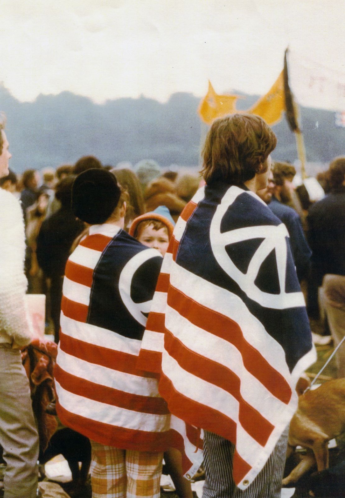
In the US, the symbol was first used by the civil rights movements. It was probably imported by Bayard Rustin, a close collaborator of Martin Luther King Jr., who had participated in the London march in 1958. Crossing the Atlantic, the symbol lost its association with nuclear disarmament and came to signify, more generally, peace: “In the 1960s in the US, it was mainly anti-war,” said Kolsbun. “I didn’t even know it meant nuclear disarmament.”
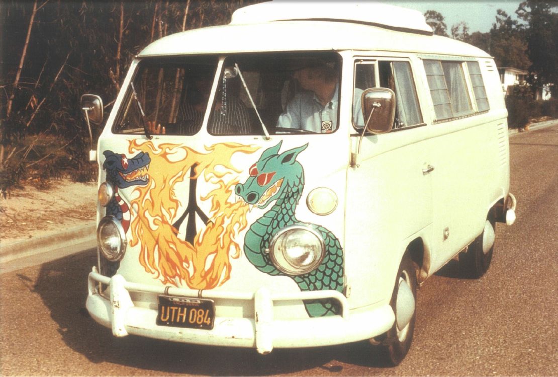
As the Vietnam War escalated in the mid-1960s, the peace symbol was adopted by anti-war protesters and the counterculture movement, finding its stereotypical place on Volkswagen buses and acid-wash T-shirts. Intentionally kept free from copyright, it traveled far and wide, appearing in the former Czechoslovakia as a symbol against Soviet invasion, and in South Africa to oppose Apartheid.
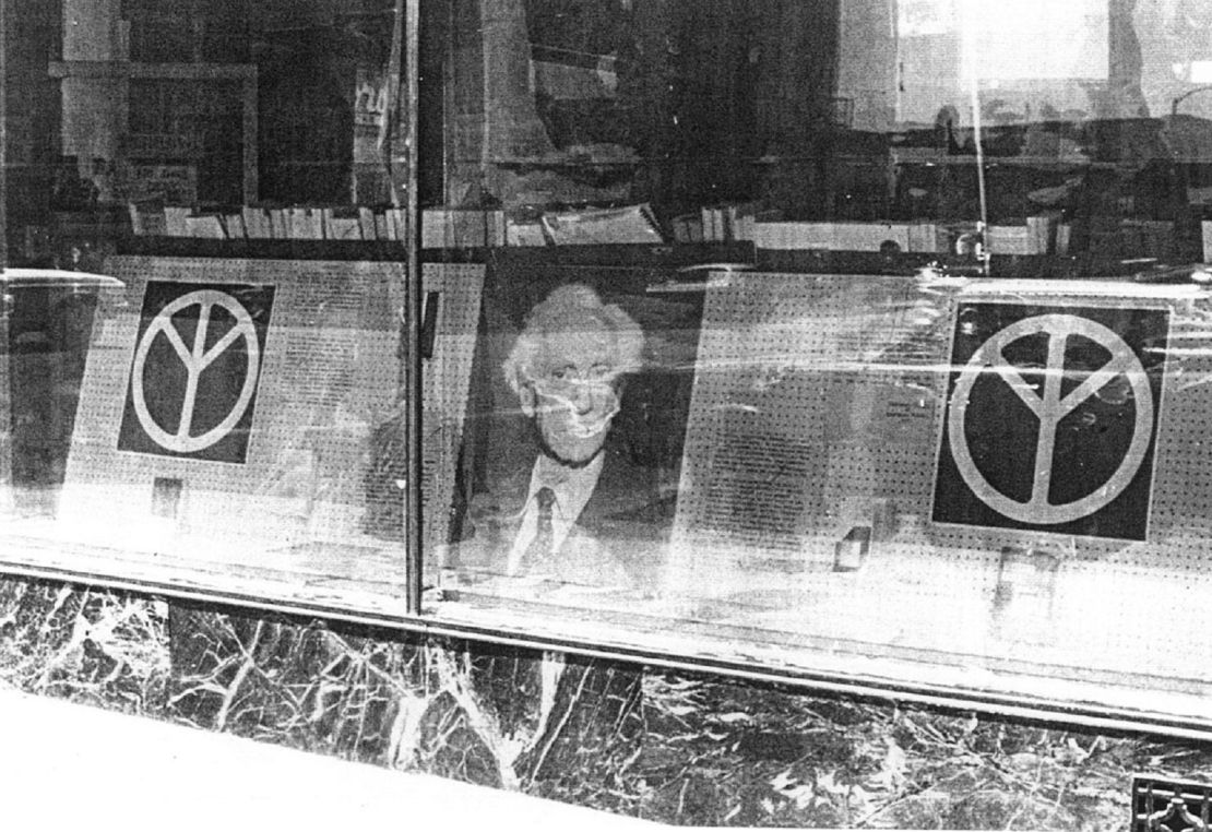
As the symbol grew in popularity, it also faced opposition. “Some really hated (it), like the far-right group John Birch Society,” said Kolsbun. “They put out a monthly magazine and, in 1969, they did a story denouncing the symbol, saying that it was a sign of the devil. It ended up all over America and the New York Times picked up on it. It got so much publicity that some people still see it as satanic sign after all these years.”
Upside down
Kolsbun and Holtom corresponded in 1975, when the former was researching for a book that would eventually be published in 2008, marking the 50th anniversary of the symbol.
“He came back with a lot of good ideas and some of his personal sketches,” Kolsbun said. “He was a dedicated person. He knew what the game was. He was a very inventive type of guy.”
According to Kolsbun, Holtom had designed an upside down version of the original, in which the letter “N” was replaced by a “U” to signify “unilateral” disarmament, and he came to regret not using it.
“He preferred the inverted version,” Kolsbun said. “I think at the very beginning he saw it as nuclear disarmament, but as time went on I believe he felt that it should really have been universal or unilateral disarmament. That would take care of all weapons. He wanted the inverted version to appear on his tombstone, but unfortunately that didn’t happen.”
In its 60-year history, the symbol has been used in support of environmental movements and women’s and gay rights, as well as featuring on all sorts of merchandise. It has appeared on Moschino T-shirts, Tiffany pendants, US stamps and even Lucky Strike cigarette packs.
Its legacy lives on and is continuously updated. After the 2015 Paris terror attacks, French artist Jean Jullien reimagined the design using the shape of the Eiffel Tower, creating a worldwide symbol of solidarity.
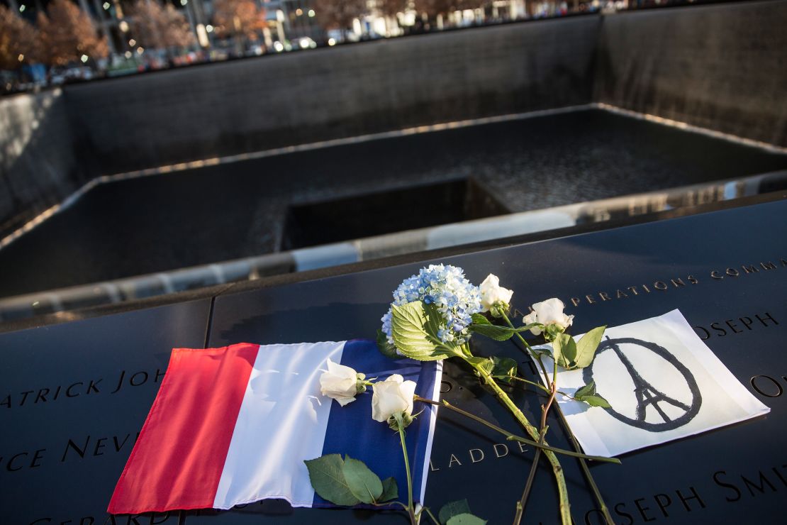
But one thing may have been lost along the way, according to Kolsbun: the original meaning.
“A lot of people still don’t know what it really stands for: no nukes. Most simply believe it means ‘peace.’ But I think it’s important to know the true meaning, because the nuclear threat hasn’t gone away. It’s actually stronger than ever.”

